Subscribe to our social channels to get the latest news about Hungary!


Sponsored content
Social media today is an excellent opportunity to enhance your brand awareness and business advancement. It is possible and easy to do if you find the right approach. I am talking about the visual component of the information you present via your accounts on social networks.
Your posts, ads, and any description of your product will go unnoticed if you don’t pay attention to the visual component: what picture you present the information with, what colors, text, and, of course, fonts you use.
It’s 2021, times change, and so do digital trends. What about fonts? Are there any popular fonts today? Of course, that’s what I’m going to show you here.
Instagram, Facebook, Twitter, Discord fonts, etc. usage is your chance to create unusual and eye-catching text for any social network to attract more viewers, followers, and eventually customers. But be careful with your font’s choice; otherwise, your unique and informative post or captions will cause the opposite reaction.
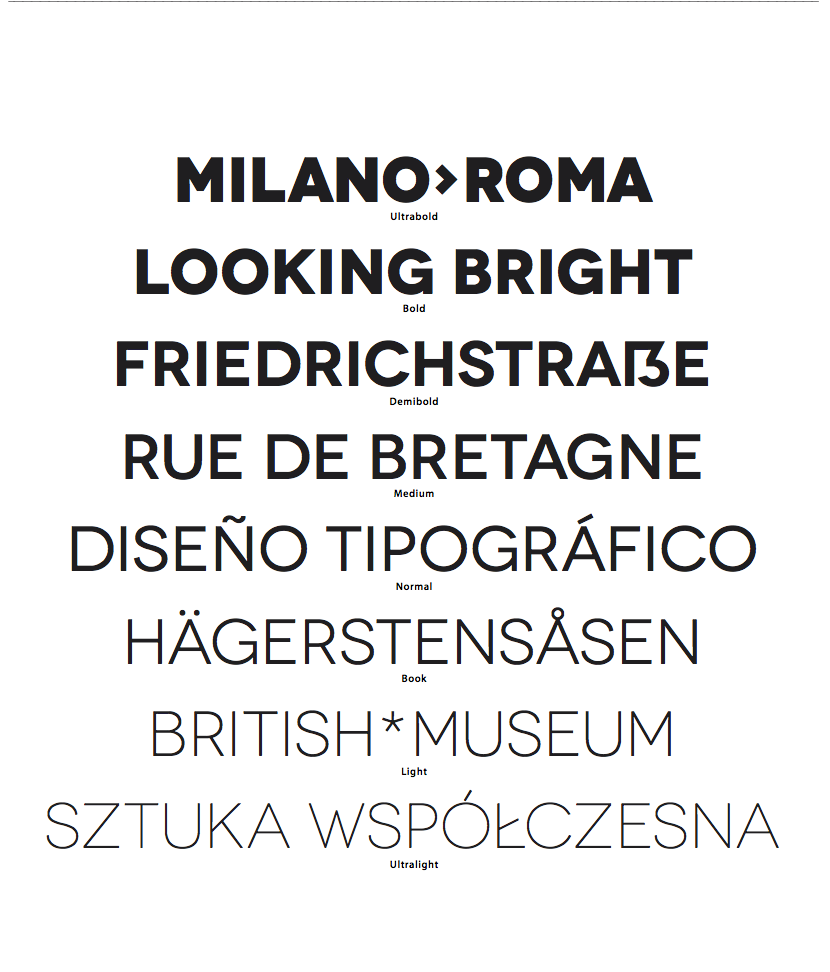
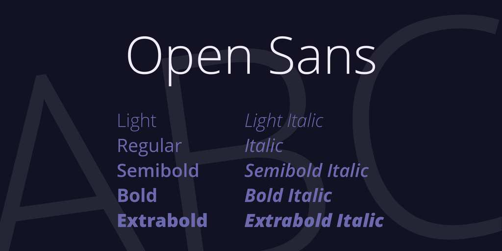
It is a relatively versatile and win-win option for all kinds of posts and advertisements. It’s also quite natural and functional, so it’s ideal if you don’t know which font to choose.
The author of the font is Julieta Ulanovsky. She was inspired by the fonts of old city posters in the Montserrat district of Buenos Aires and decided to recreate them in the digital world.
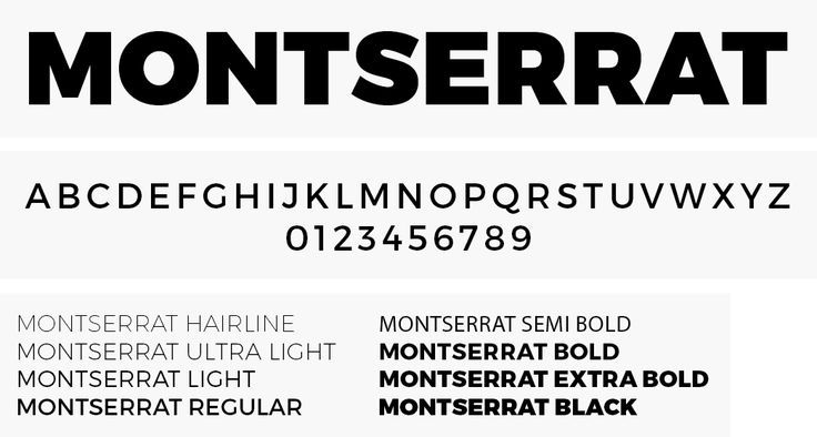
A readable yet straightforward and easy-to-understand font will appeal to web designers, bloggers, and advertisers alike. The font is upright, and sans serif.
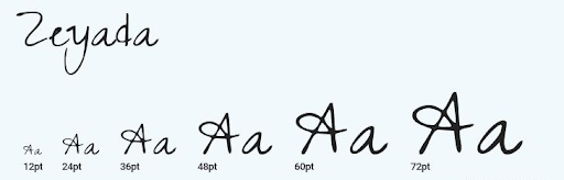
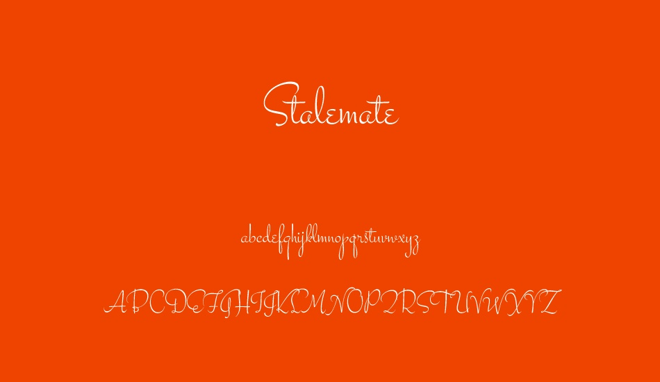
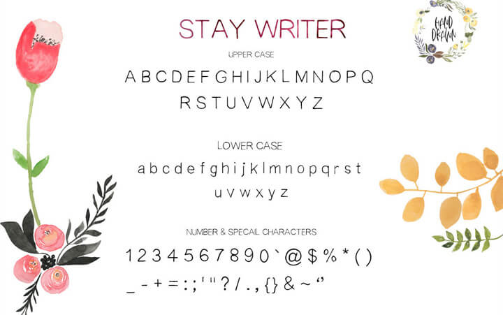
If you’re a creative person and you’re advertising or writing about a product that you’ve made yourself, this is the typeface for you. It mimics letters that look like they are written with a human hand using a pen.
The letters are swirly and irregularly shaped, which makes all text written in this typeface look alive.
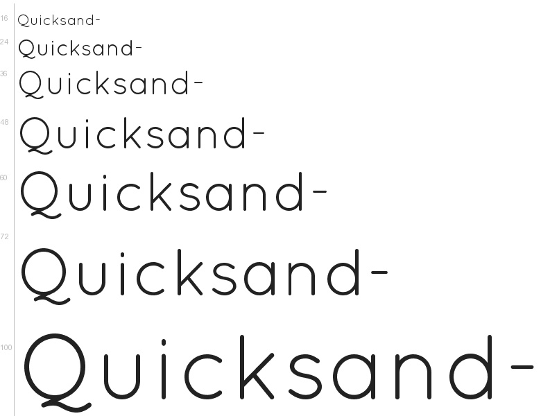
It is a thin, sharp, yet rounded-cornered typeface designed by Andrew Paglinawan. The large letter spacing makes the words easy to read and doesn’t overload the text. It’s an excellent option both for headers and the main text.